
Listen, I know most website templates are not giving you much to work with. It usually goes something like:
- Intro.
- Contact form.
- FAQs.
- A little “can’t wait to hear from you!” moment.
- The end.
And sure, that technically works. But if your contact page is only acting as a form, you’re selling yourself short.
Whether you’re DIY-ing your website or working with a designer, your contact page can do so much more than collect a name, email, and awkward “tell me more about your project” response.
It can build trust.
Answer last-minute questions.
Show off your personality.
Guide the right people toward the next step.
And make someone think, “Oh wow, this person really thought this through.”
So, let’s talk about how to write a contact page that doesn’t suck.
What Is the Purpose of a Contact Page?
The obvious answer? To help someone get in touch with you.
Groundbreaking. Revolutionary. Call the press.
But your contact page is also prime real estate for conversion, nurturing, and giving people one final little nudge before they officially reach out.
Because by the time someone lands on this page, they’re probably interested.
They may not be FULLY convinced yet, but they’re close enough to be poking around. This is your chance to make the next step feel easy, clear, and aligned.
Your contact page should help them feel like:
- “Oh, I’m in the right place.”
- “I know what happens next.”
- “This person gets it.”
- “Okay, I’m ready to inquire.”
And that is exactly why we are not wasting this page on a lonely form and a prayer.
15 Section Ideas to Include on Your Contact Page
There are a lot of contact pages floating around on the wild west of the internet, and most of them fall somewhere between “technically fine” and “please, I am begging you to add literally anything else.”
By the end of this post, I want yours to land somewhere between “solid” and “damn, this is thoughtful.”
Here are 15 section ideas you can include on your contact page.
1. An Intro That Doesn’t Just Say “Contact”
Please do not waste your header on the word “Contact.”
Like, yes. They know. They clicked the contact page. We’re all here together.
This is your last chance to remind your website lurker that you understand what they need and that you can help.
Instead of something generic, use this section to speak directly to the moment they’re in.
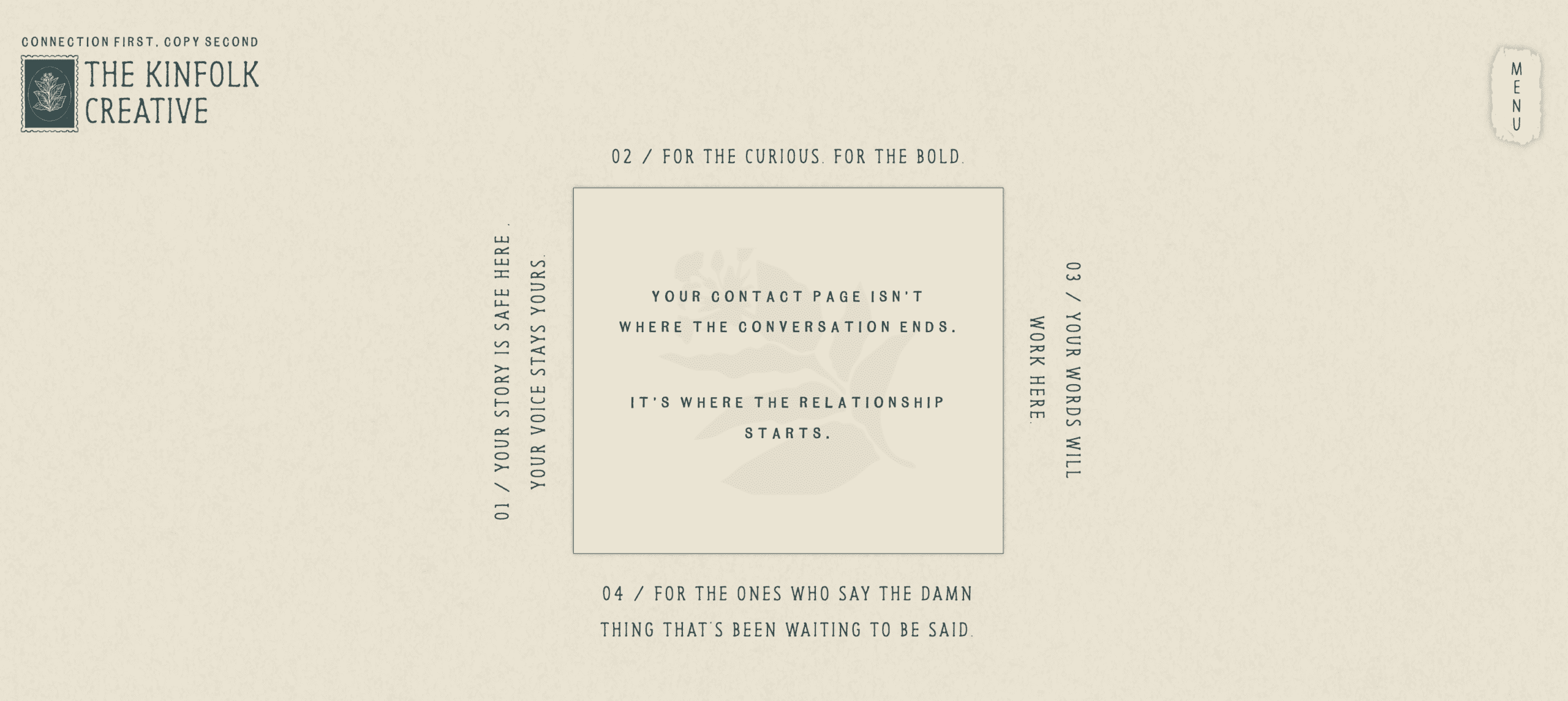
For example, on my own contact page, I leaned into the idea that this isn’t where the conversation ends. It’s where the relationship starts.
That works for Kinfolk because our people value connection, collaboration, and feeling like there’s an actual human behind the website. So instead of treating the contact page like a cold transaction, we made it feel like the beginning of something.
That’s the goal.
Your intro should make the inquiry feel like a natural next step, not a weird little business transaction in a trench coat.
2. Testimonials
If someone is on the fence, a strong testimonial can do a lot of heavy lifting.
This doesn’t need to be a massive wall of praise. In fact, please don’t make it a massive wall of praise.
Add one to three testimonials that reinforce the kind of experience you want people to expect from you.
Think about testimonials that speak to:
- Your communication
- Your process
- Your personality
- The transformation
- How easy or comfortable it felt to work with you
- The results they got after hiring you
This is especially helpful if your offer involves trust, intimacy, creativity, or a higher investment.
Which, for most service providers, it does.
3. A Submission Form — Obviously
Yes, you need the form.
But not just any form.
Your inquiry form should collect the information you actually need to determine whether someone is a good fit. This is where you can screen for alignment, budget, timeline, project type, and potential yellow or red flags.
You don’t need to interrogate people like they’re applying for witness protection, but you do want to ask enough questions to make the next step easier for both of you.
A few helpful questions could include:
- What service are you interested in?
- What’s your ideal timeline?
- What’s your budget range?
- What made you reach out to me specifically?
- What are you hoping this project helps you with?
That last one? Chef’s kiss. It usually tells you a lot.
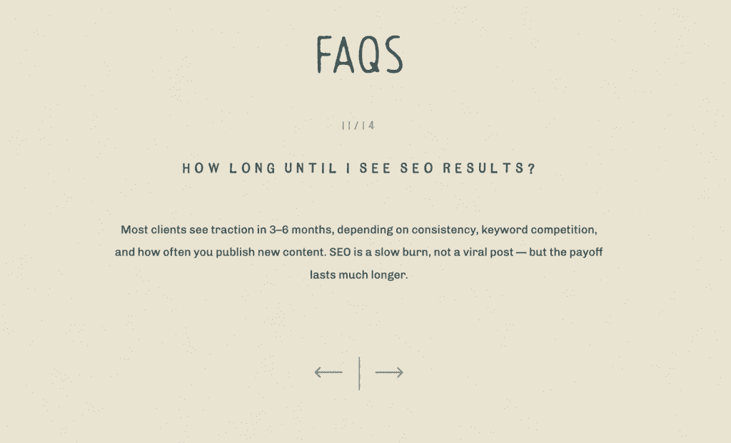
4. FAQs
For the love of God, please do not skip your FAQs.
Or worse, remove them because they “feel too long.”
FAQs are helpful for your potential lead, helpful for SEO, and helpful for AI search. But more importantly, they answer the questions someone may be too tired, overwhelmed, or embarrassed to ask.
The key is knowing what belongs in the FAQ section versus what belongs in your main website copy.
Your main copy should answer the big trust-building questions, whereas your FAQs should answer the logistical questions that don’t need a full main character moment.
Think:
- How soon should I reach out?
- What happens after I inquire?
- Do you travel?
- Do you offer payment plans?
- What if I’m not sure which service I need?
- How long does the process take?
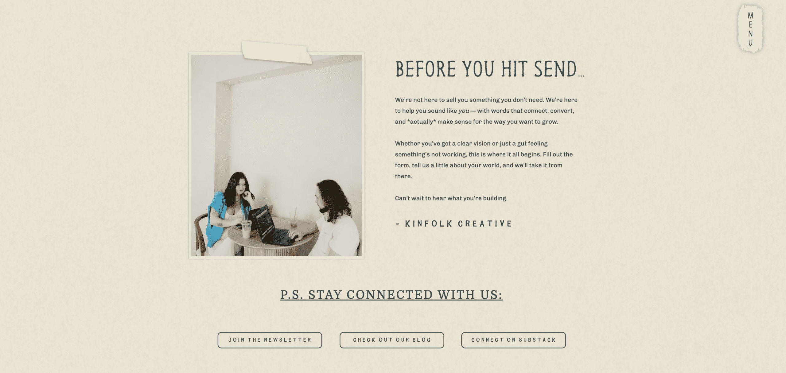
5. A Mini About Section
This is one of my favorite sections to include on a contact page because not everyone reads your website in order.
Some people will land on your services page, vibe with what they see, click contact, and never touch your about page.
Rude? Maybe. Normal? Absolutely.
A mini about section gives you one more chance to introduce yourself, add personality, and remind them why you’re the right person for the work.
Keep it short and relevant. You don’t need your entire origin story here.
Just enough to say:
- Here’s who I am.
- Here’s how I approach this work.
- Here’s why that matters for you.
Bonus: it also adds more meaningful copy to the page, which can support SEO without stuffing random words onto your site like a chaotic little keyword goblin.
6. Email Newsletter Opt-In
Not everyone who lands on your contact page is ready to inquire right this second. Annoying, but true.
Some people need more time. Some people are waiting on budget. Some people are silently stalking your work like it’s their part-time job.
Give those people a way to stay connected.
Depending on your business, this could be a simple newsletter opt-in or a free resource. Either way, it gives the “not yet” people somewhere to go besides disappearing into the internet abyss.
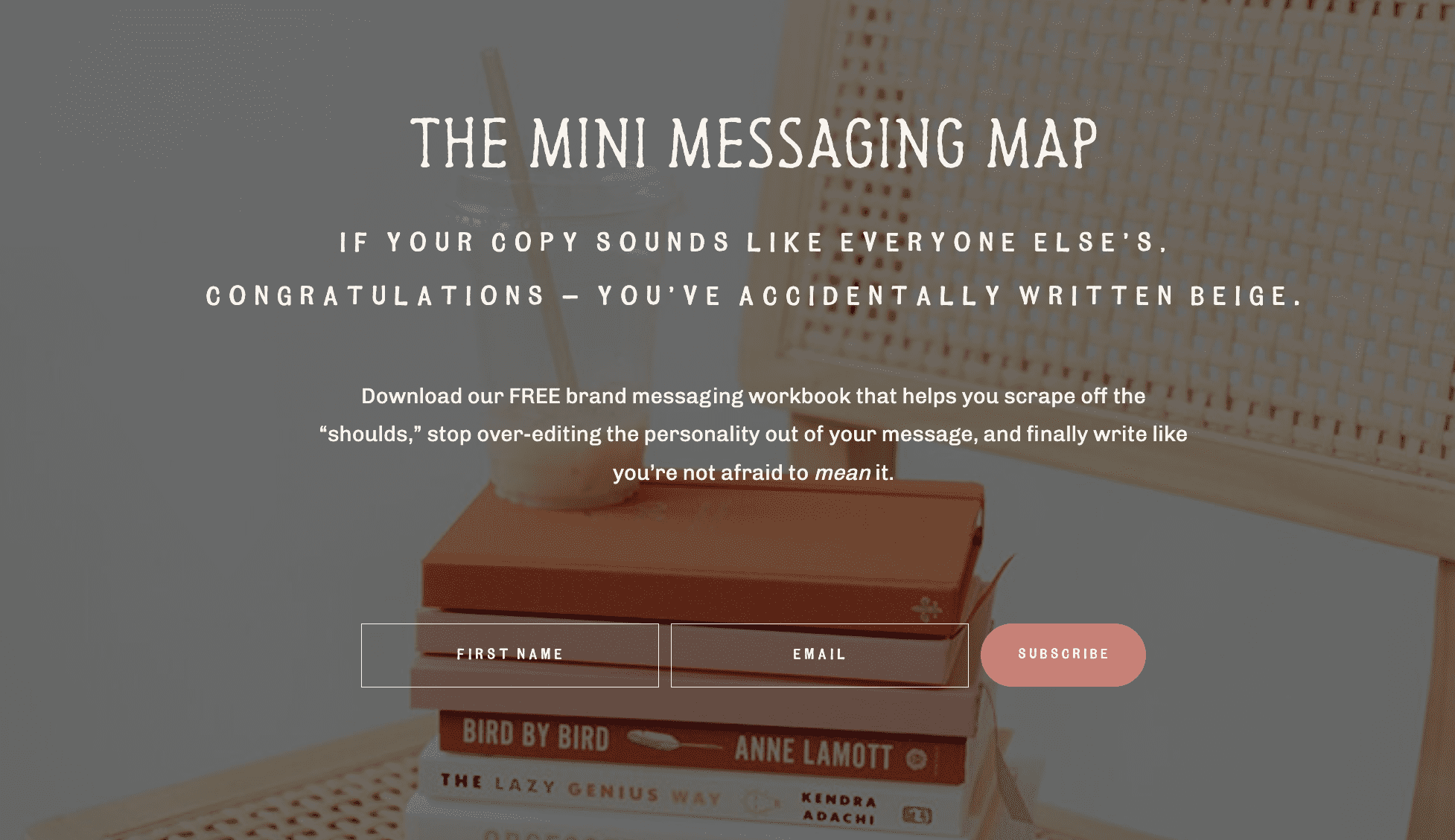
7. A Freebie
I’m a slut for a good freebie. Truly.
But placement matters.
A freebie should make sense for the page it’s living on. For example, if you have a blogging freebie, it probably makes more sense on your blog page than your contact page.
But if your freebie helps someone prepare to work with you, understand your process, or make a decision about their next step, your contact page could be a great spot for it.
Examples:
- A pricing guide
- A planning checklist
- A “which offer is right for you?” quiz
- A session prep guide
- A website audit checklist
- A wedding planning resource
The goal is not just to toss a freebie somewhere because you made one in Canva at 11:47 p.m. and now it needs a home.
The goal is to make the page more helpful.
8. Popular Blog Posts
Your blog posts can absolutely support your contact page.
Especially if they help answer common questions, showcase your process, or build trust before someone inquires.
You could feature:
- A behind-the-scenes post
- A client experience blog
- A planning guide
- A comparison post
- A “what to expect” post
- A case study
- A resource that supports your offer
This gives potential leads a little preview of what working with you might feel like. It also helps keep people on your site longer, which we love.
9. Best-Selling Products
If you sell digital products, templates, courses, presets, guides, or smaller offers, your contact page can be a great place to feature them.
Especially for people who may not be ready for your full service yet. Think of it like the appetizer before the full meal.
Maybe they’re not ready to book the whole experience, but they are ready to buy the template, download the guide, or take the next tiny step into your world.
10. Go-To Vendors
As a girls’ girl, I loooove a good vendor shoutout.
If you’re constantly referring people to the same trusted businesses, your contact page can be a smart place to share them.
For example, as a website copywriter, I keep a running list of designers I love recommending to clients.
If you’re a photographer, you might share planners, florists, venues, hair and makeup artists, or other vendors your clients are always asking about.
This makes you helpful before someone even hires you.
11. Portfolio Feature
Your contact page is also a great place to feature one more project, gallery, or case study.
Maybe they skipped your portfolio page. Maybe they saw it but didn’t click around much. Maybe they need one last “oh yes, this is the vibe” moment before reaching out.
Choose a project that reflects the type of work you want more of.
Not just the prettiest one, the most aligned one. Because your contact page should not just help people inquire. It should help the right people inquire.
12. Social Media Links
Give people another way to connect with you beyond your website.
Add your Instagram, Pinterest, Threads, TikTok, Substack, podcast, YouTube, or whatever platforms you actually use.
Emphasis on actually use.
If your last TikTok was from 2021 and featured a trending sound we’ve all collectively agreed to forget, maybe don’t send people there.
Choose the platforms where you’re active and where your personality, work, or expertise has room to shine.
13. Podcast Feature
Have a podcast? Give it a little moment.
You could feature your most helpful episode, your favorite interview, or the episode that best introduces your approach.
This is especially great if your podcast helps people understand your values, process, or perspective before working with you.
Because sometimes hearing your voice builds trust faster than reading another paragraph of copy ever could.
Painful for me, a copywriter, to admit. But true.
14. On-Brand Inquiry Submission Copy
As a copy girl, there are few things I hate more than a generic form confirmation message.
You know the ones.
- “Thanks! We’ll be in touch.”
- “Check your inbox.”
- “Your form has been submitted.”
Okay, Sharon. Thrilling.
You.👏🏻 Can.👏🏻 Do.👏🏻 Better. 👏🏻
This is such a small detail, but it can make the whole experience feel more thoughtful.
Instead of a generic message, write something that sounds like your brand.
For example:
“Your inquiry has officially landed in our inbox, and we’re already doing a tiny happy dance. Keep an eye on your email because we’ll be in touch soon with next steps.”
Or:
“You did the thing! We’ll review your inquiry and get back to you within 48 business hours. In the meantime, feel free to stalk the blog, peek at recent work, or start dreaming up what comes next.”
It does not need to be dramatic, it just needs to sound like you.
15. A Confirmation Page — If You’re an A+ Student
If you really want your gold star, redirect your inquiry form to a custom confirmation page.
This page can tell people exactly what happens next and keep them engaged after they inquire.
You could include:
- Your response timeline
- Next steps
- A link to your pricing guide
- Helpful blog posts
- A mini welcome video
- Testimonials
- Social links
- A newsletter opt-in
- A reminder to check their spam folder because technology loves to play games
This is one of those extra details that makes the experience feel polished and intentional.
And no, not everyone needs one. But if you want your inquiry process to feel really buttoned up, this is a great move.
The Point Is…Your Contact Page Can Do More Than Collect Dust Client Leads
Your contact page does not have to be the most boring page on your website. In fact, it shouldn’t be.
This is the page people visit when they’re thinking about taking the next step with you. So give them the information, reassurance, personality, and direction they need to actually do it.
You don’t need to include all 15 of these sections. Please do not turn your contact page into a scroll-until-your-finger-cramps situation.
But choose the sections that make sense for your business, your audience, and your offer. Because a good contact page doesn’t just say, “Here’s how to reach me.” It says, “You’re in the right place. Here’s what happens next.”
And that, my friend, is how we create a contact page that doesn’t suck.
Want more copywriting tips like this? Join my weekly newsletter below. Every Wednesday morning, I send out one practical copywriting tip to help you DIY your website while I basically hold your hand through the process.

How To Write A Contact Page That Doesn’t Suck

We’re Kinfolk Creative—better known as the Visibility Duo.
One part strategy, one part storytelling, and a dash of “why didn’t I think of that?” We help business owners ditch the generic copy and finally show up online like they actually mean it.
If your website reads like a resume from 2014, your “About” page makes you cringe, or you’re just plain tired of yelling into the void—we’re your people.
We write words that sound like you, speak to them, and get clicks without the cringe.


